7 years ago
Subscribe to the latest updates
Tables are the most natural way to explore data and are more fundamental than charts. But charts help to visually compare the aggregation of numbers and find answers quickly and intuitively.
If you combine tabular and chart representations you can compare a lot of key metrics in one place and get a dense information report. That is why we created Visual Tables and did our best to make Edward Tufte proud of us.
How to create a simple table
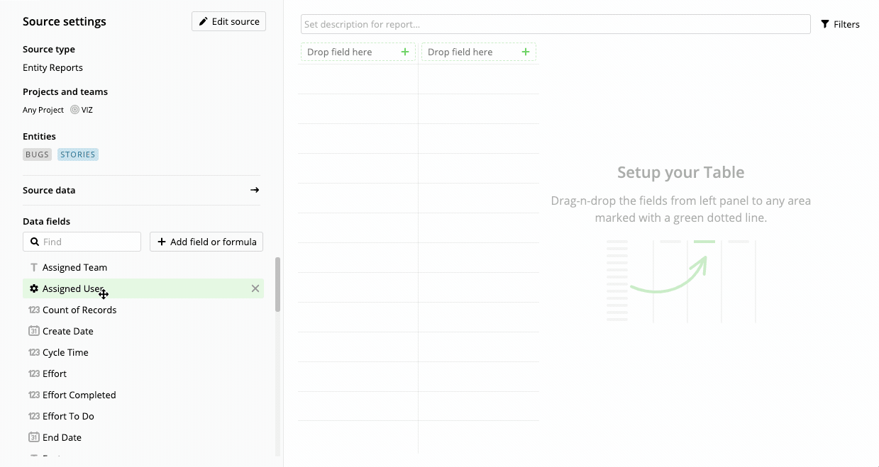
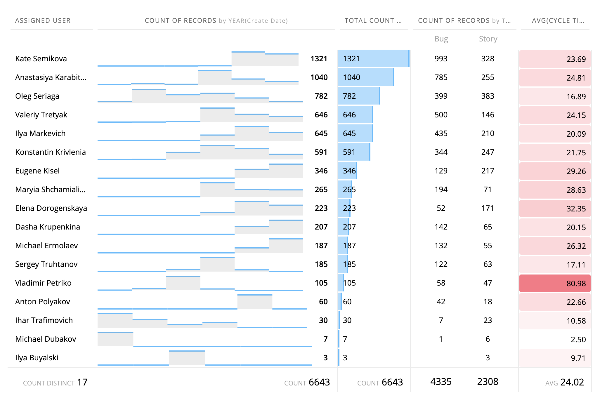
Let's create a simple table that shows developer performance.
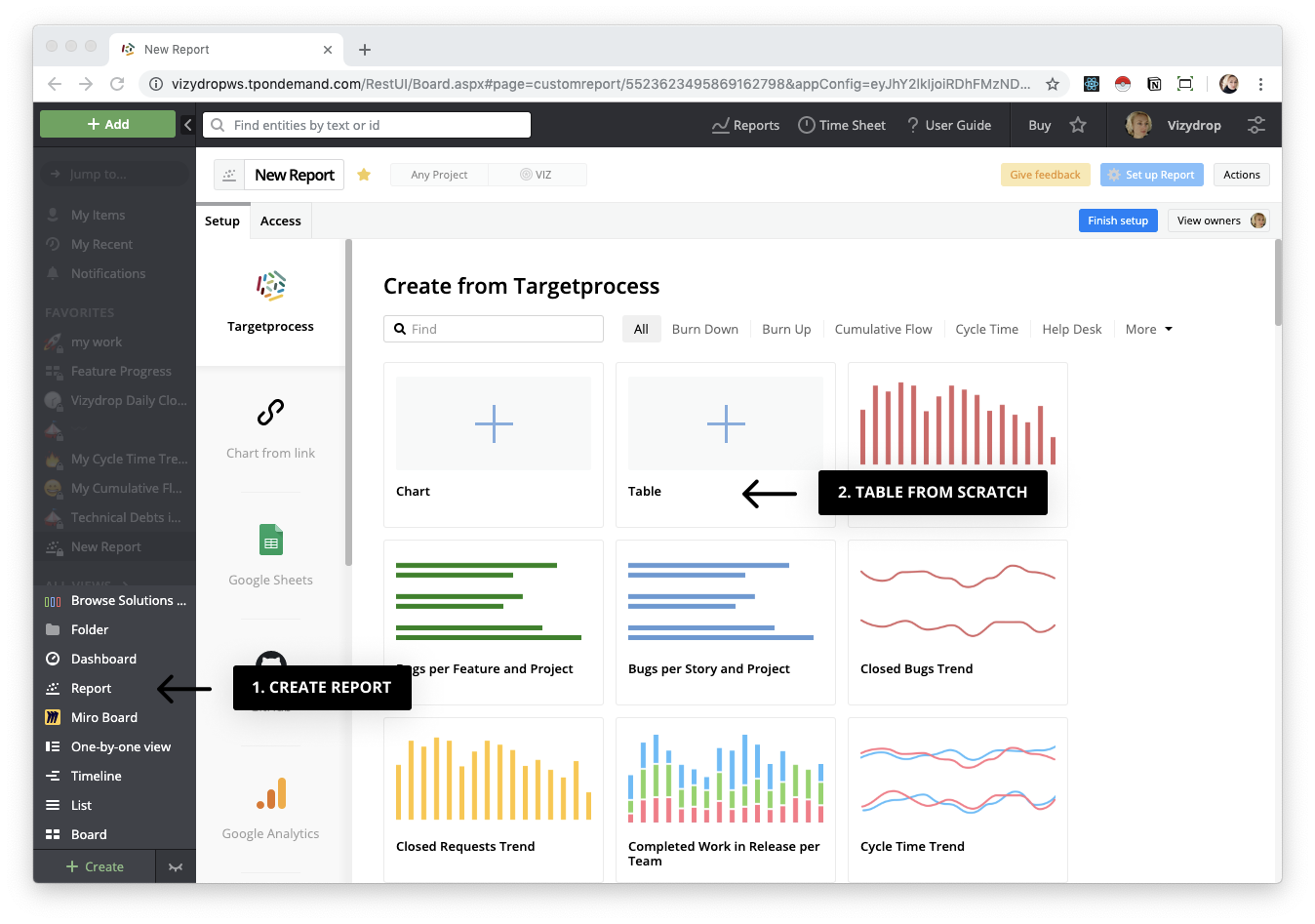
Start with the "Create Report" button in the left menu. Choose any tabular template or simply create a Table from scratch and set up your source in the same way as when creating a chart.
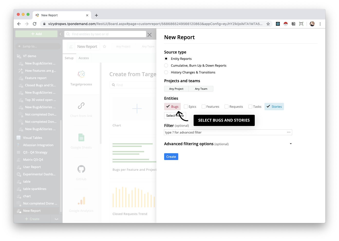
Select Bugs and Stories as a source.
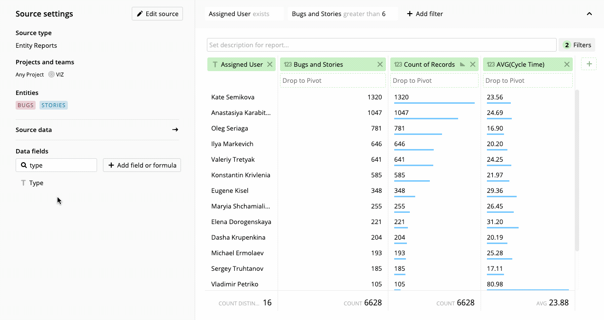
Drag and drop Assigned User, Counts of Records (that means the sum of bugs and stories ), Cycle Time and other fields you want to see as a column.
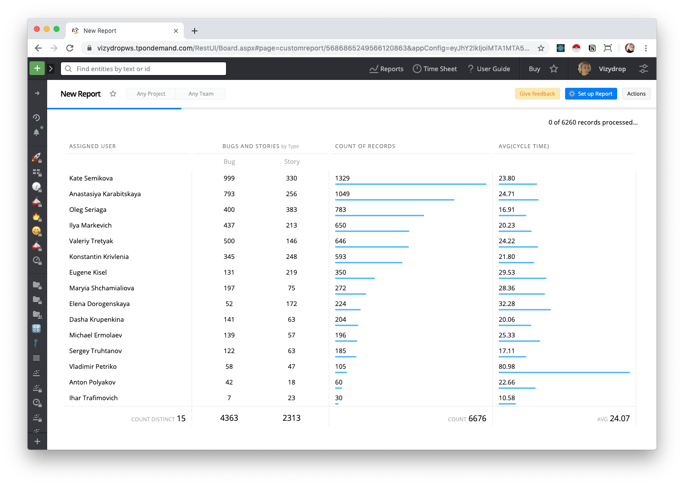
That's it. Finish setup and keep track of changes in the table.
Resize and Sorting
Each user can quickly resize columns not only in edit mode, but also while viewing, allowing customization for their screen size and preferences. Sorting will have the same behavior in the future. For now, sorting is available in the column settings popup in edit mode only.
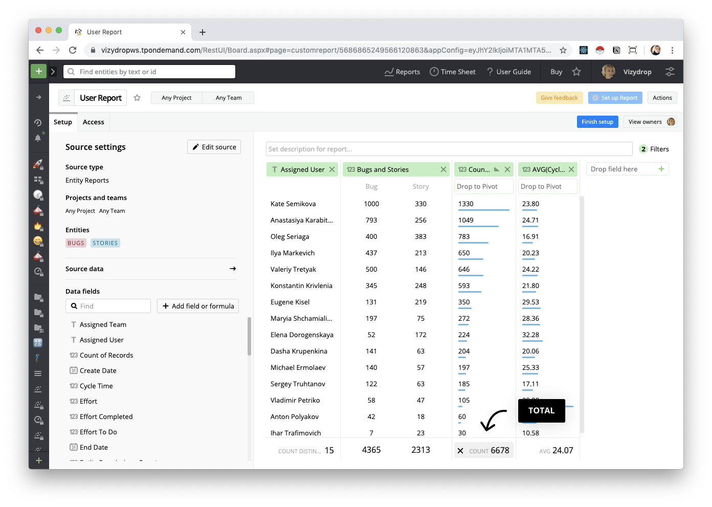
Total
Under each column the Total value is automatically displayed. You can delete or add it again by simply hovering over it.
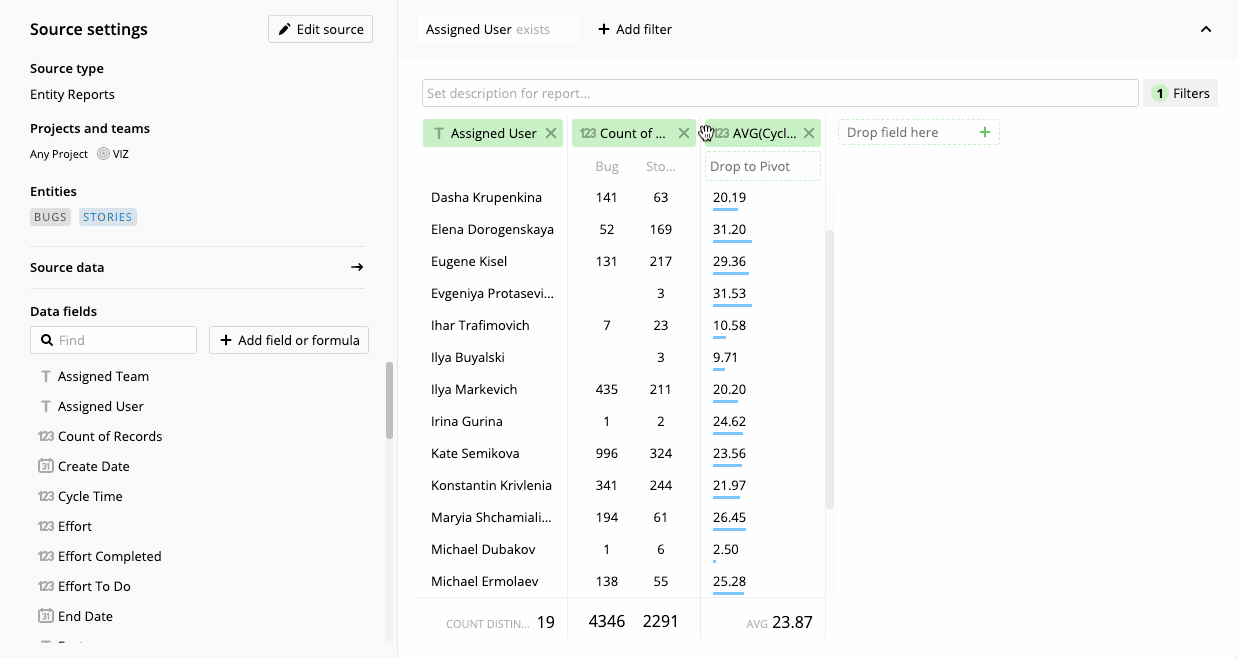
Filter
You can filter data just above the table.
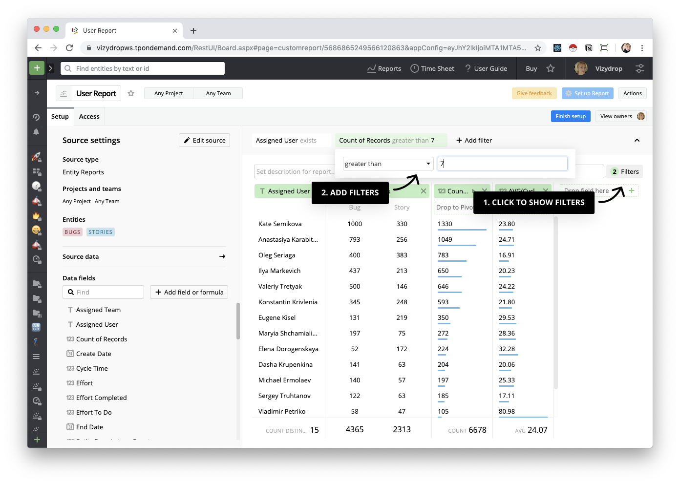
Pivot table
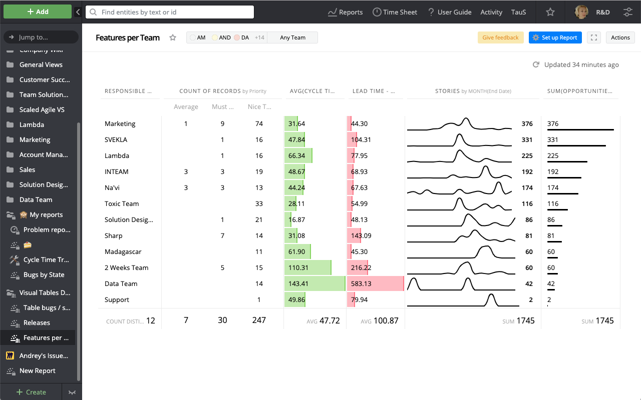
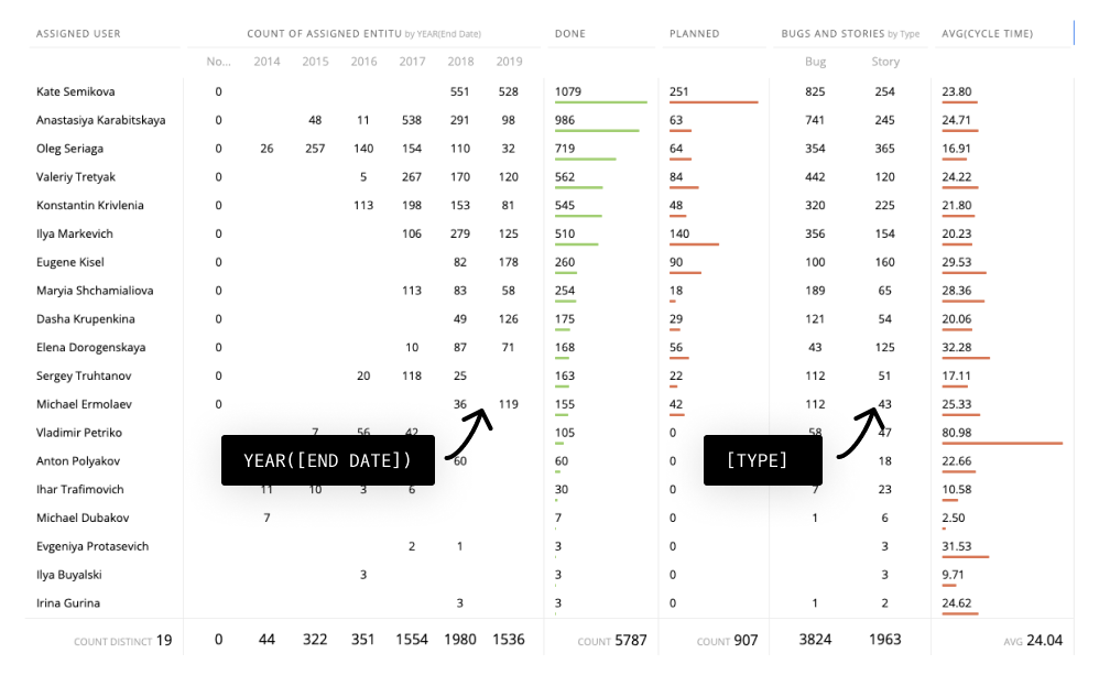
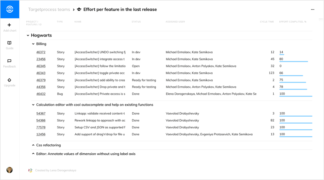
To understand the dynamics of numerical values you can split them by any field or write a custom calculation. For instance, you can find out what kind of entity was assigned to the user using the pivot Count of records column by Type.
Just drag and drop the Type field from the data catalog in the droppable area behind the column title.
If you’re feeling adventurous, write a custom calculation in the column settings popup to find out something unusual.
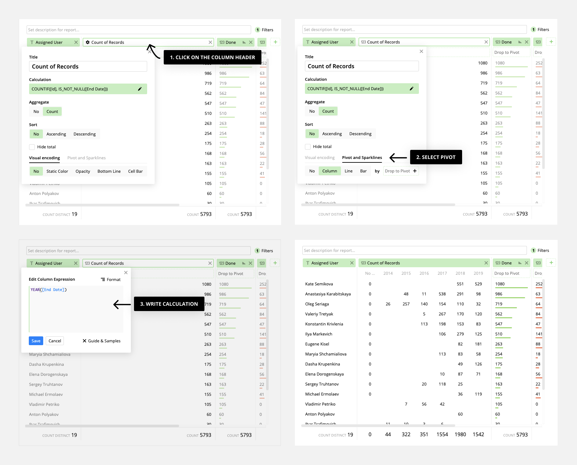
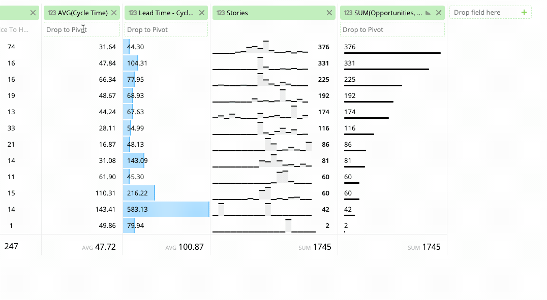
Sparklines
If your calculation in the pivot is a Date, then it can be desirable to see the historical dynamic of the values by month, week or year. That’s why you can visualize numbers as a line or bars instead of a column.
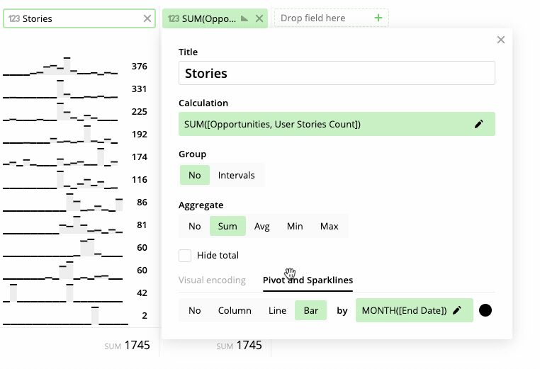
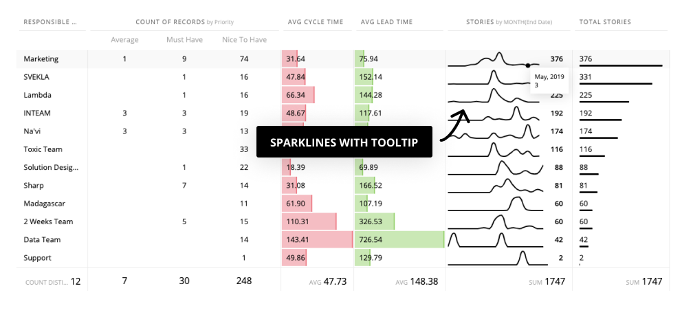
For instance, you can see the productivity pattern of the team by splitting stories by End Date. The tooltip shows separate values.
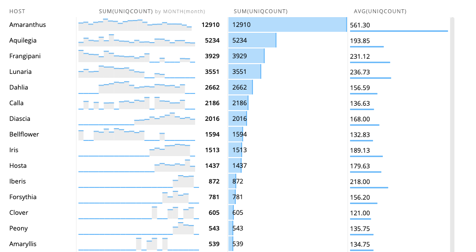
Or you can explore the feature usage by customers.
Or developer performance during years.
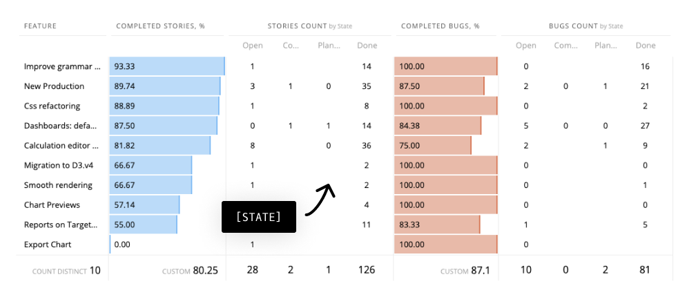
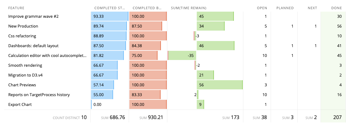
Visual encoding
It can be hard to understand the data if we only have numbers. Only the length or absence of a number make the difference quickly recognizable. That is why you can use Visual encoding for numbers.
Just select the appropriate visualization with the switcher.
Note - Visual encoding replaces the Pivot Table.
If your data set has negative and positive values in the same column, the cell bar will be displaced relative to the zero axis.
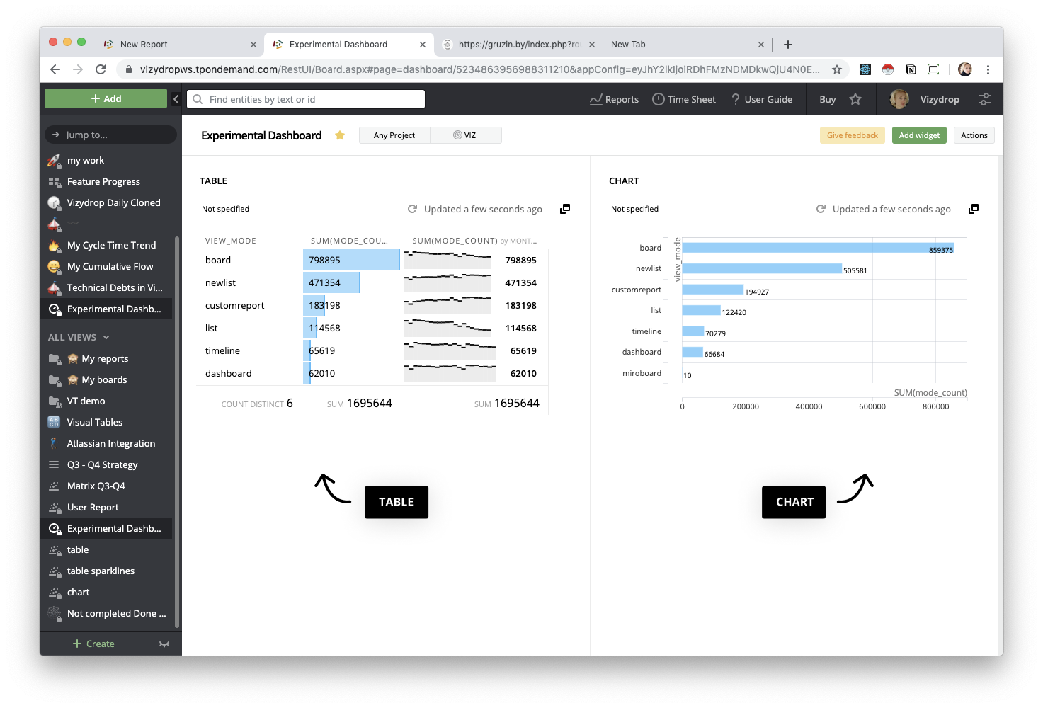
All view features of Visual Report are available for Visual Tables. For instance, you can switch context, share a report, reveal data and export it in CSV.
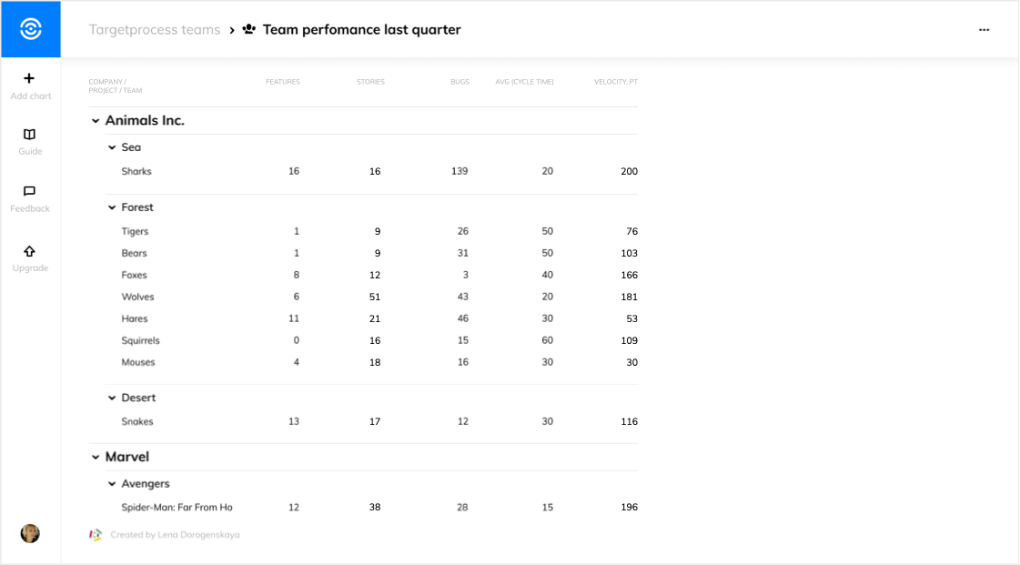
Table on Dashboard
When compared to a chart, a table can contain more information because of its information density. Scrolling and resizing makes it more efficient in limited spaces, so experiment with charts and tables to get the best result for the dashboard.
Upcoming
Now we are thinking about the future…

In that wonderful future we are going to:
- Add filters and sorting on View
- Add conditional color encoding for rows
- Group rows by Category
Our plans in pictures:
Please stay tuned. You can provide feedback using contact@vizydrop.com
Add comment